FANS are all saying the same thing after Aston Villa unveiled their new club crest which will be used from next season.
The moment the Villans released their new-look circular badge supporters started highlighting the similarities to that of Chelsea’s.
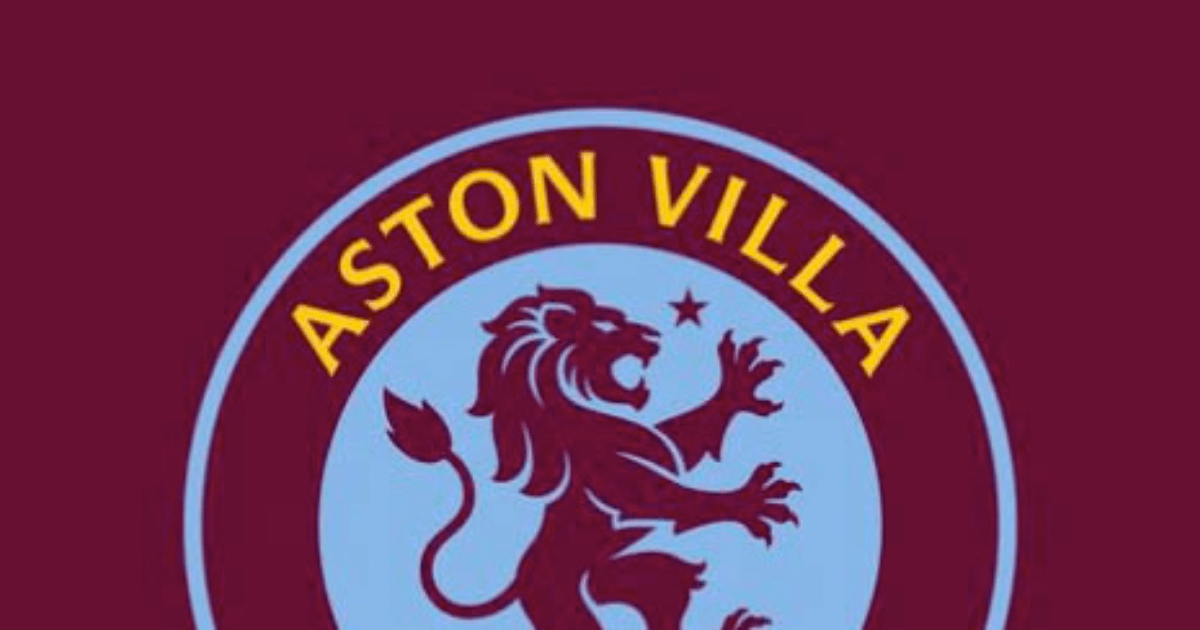
Aston Villa revealed the badge that the club will wear from the start of the 2023/24 season.
However many football fans have pointed out similarities to Chelsea’s current badge.
The new version of the badge is round and feature’s the club’s lion in the blue centre with the words “Aston Villa” and the year the club was founded, 1874, in the claret rim.
The Lion is now facing “forwards” as the club looks to the future and is next to a star that symbolises the one European Cup that the club has won.
However, that does not hide the fact that it is strikingly similar to the current Chelsea badge, which lots of fans have been keen to point out.
One tweeted: “Makes sense to be fair. Similar to Chelsea. One chant. Villa villa villa. Chelsea Chelsea Chelsea.”
Another said: “I honestly thought it was a troll. Have you guys had your Twitter account hacked by a Chelsea fan or something?”
A third added: “Like where they intentionally trying to make it look like Chelsea’s badge?”
A fourth said: “Nothing wrong with the badge itself, but this trend of clubs changing their crest to a circle is getting old now.
“Also, it looks like a rip off of Chelsea’s crest.”
PLAY OUR DREAM TEAM WORLD CUP FANTASY FOOTBALL GAME TO WIN A SHARE OF £50k
Former Chelsea defender John Terry also liked the new crest, although it could simply be down to his ties to the Villans after coaching at the club rather than liking the Chelsea similarities.
Not all fans were upset though with some defending the new design as they claim it is modelled after previous crests that the Premier League club has had.
One said: “We had the round badge with the standing lion before Chelsea.”
Another added: “They’ve used a variety of crests adopted by the club throughout mid-’70s, ’80s, and early ’90s as a template for the new design.
“I think it looks great! Nice to see a club embracing their history when considering and designing new crests!”
A third tweeted: “A modern take on the 82 home shirt would be lovely, similar to what United have done with this season’s kit.”